Logos
“A brand ‘lives’; it is born, matures, develops, has a personality, and if it doesn't evolve, it may not survive.” —Desjardins Magazine, 2003
A logo is vital to a brand's identity. Desjardins Group's logo has seen a number of changes over the years, retaining some distinctive features along the way.
The very first logo featured the intertwined “CPD” initials (for “caisse populaire Desjardins”). It made its appearance in the early 1950s and was mostly used on caisse passbooks.
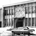
From the time the first caisse was founded in 1900 until the death of Alphonse Desjardins in 1920, the budding caisse populaire network didn't have a distinctive visual identity. No logo appeared in the first annual reports, whose design was quite plain. For many years, the same was true of the caisse outside signage. In the 1940s, for example, the sign outside of Caisse populaire de Lévis consisted only of its name in block letters, the year it was founded and the phrase “Société régie par la loi des syndicats coopératifs.”
The first imagery to be used was a portrait of Alphonse Desjardins, which came into use with the founding of the Fédération de Québec des unions régionales de caisses populaires Desjardins in 1932. Official Federation documents such as letterhead, however, still bore no logo into the 1950s. Most of the time, they only featured the institution's name and address along with the phrase “Société régie par la loi des syndicats coopératifs.”
The oldest documents bearing the intertwined initials date back to the early 1950s. It's still not known when exactly the design first appeared or who created it. The initials were mostly found on caisse passbooks, but its usage wasn't widespread. It was never used in the organization's magazine (Revue Desjardins) or on official Federation documents.
Over time, the intertwined initials gained some popularity. When the coat of arms was adopted in 1960, it was announced as their replacement. Use of the initials did decline, but without any kind of organization-wide policy on the matter, it continued to resurface occasionally. In 1969, for example, 9 years after the coat of arms was adopted, the initials were featured on the night deposit box at the new head office of Caisse populaire de Lévis.
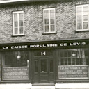 The head office of Caisse populaire de Lévis in the 1940s (FCDQ)
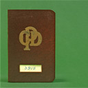 A passbook bearing the CPD logo (SHAD)
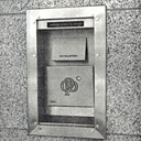 The Caisse populaire de Lévis night deposit box in 1969 (CDDL)
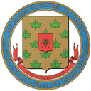
Designed by heraldry expert André Genest, the coat of arms was adopted by the Board of Directors of the provincial Federation on October 25, 1960. It was used across Desjardins until the hexagon logo was introduced.
At the centre of the symbol are 2 shields. The first is gold, overlaid with a maple leaf pattern, representing Canada. The second shield is red and features a bee, representing the virtues of hard work, efficiency, perseverance and cooperative action. The bee, which would continue to feature in Desjardins logos, was not an entirely new symbol at the time. Blank cheques printed by the Federation for the caisses populaires in 1953 featured a beehive next to a portrait of Alphonse Desjardins.
The bee and maple leaves likely owe their origin to the Federation's general manager, Cyrille Vaillancourt, who approved the final design and was involved in the consultation process. Early in his career, he was head of the beekeeping department at Quebec's Ministry of Agriculture, where he founded beekeeping and maple syrup cooperatives.
In Revue Desjardins, Émile Girardin, President of the provincial Federation, welcomed the coat of arms as a unifying symbol that the organization had been lacking. He added that the accompanying motto, “s'unir pour servir” (unite to serve), was a call for unity among all the Desjardins caisses. As soon as it was adopted, directors planned to send copies of the “symbol of unity” to every caisse. Items featuring the coat of arms were handed out to participants of the congress held in Montreal in May 1961.
The coat of arms was used across Desjardins. In the caisses, it replaced the CPD logo on passbooks. It was also used on official documents and on signage for the caisses, unions régionales and the Federation. 15 years after it was adopted, the coat of arms had become the official symbol of Desjardins Group, but would soon be replaced by the hexagon logo.
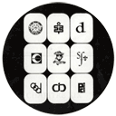
During the 1960s, all Desjardins components adopted their own emblems and logos. Placed together in a circle, they are, from left to right starting at the top: the provincial Federation, Société d'assurance des caisses populaires, Assurance-vie Desjardins, La Sauvegarde, La Sécurité, Société de fiducie du Québec, Association coopérative Desjardins, Institut coopératif Desjardins and Les Placements collectifs inc.
 The Desjardins Group coat of arms in the 1960s.
 The coat of arms displayed on the head office of Union régionale de Joliette, inaugurated in 1962. (FCDQ)
 Logos and emblems of Desjardins Group components in the 1960s (FCDQ)
Officially adopted on March 8, 1977, this logo represents a stylized bee in a honeycomb cell. Like the bee on the coat of arms, it symbolizes the virtues of hard work, efficiency, perseverance and cooperative action. The sides of the hexagon represent the multiple components that make up Desjardins Group.
Less than 15 years after the coat of arms was adopted, the provincial Federation first considered adopting a new visual identity. At the end the summer of 1974, consultations were launched to get input from the caisses. The Union régionale de Montréal embarked on a similar undertaking the following year. In the summer of 1976, it hired communications firm Cabana Séguin to design a new logo. The stylized bee inside a hexagon representing a honeycomb cell was adopted at the Union régionale de Montréal's annual general meeting on November 27, 1976.
During that fall, the provincial Federation, feeling the coat of arms was outdated, asked Cabana Séguin to continue the work it had done for the Union and find a logo for the whole of Desjardins Group. In February 1977, the firm proposed using the one it had designed for Union régionale de Montréal. The hexagon logo was officially adopted on March 8, 1977, at Desjardins Group's annual general meeting. The plan was for subsidiaries to imbed their own symbol in the centre of the hexagon, in place of the bee. Interestingly, the same image had been used on the 1967 annual reports, a full decade before the logo was officially adopted.
The most apparent sign of continuity was the bee. Still symbolizing the virtues of hard work, efficiency, perseverance and cooperative action, it had been redesigned in a stylized fashion. The circle enveloping the coat of arms became a hexagon, representing a honeycomb cell. Its 6 sides stood for the components making up Desjardins Group. The colour green, symbolizing growth and development, also signalled action, youth, hope and wisdom.
 Cover page of the Fédération 1967 Annual Report. The coat of arms is placed within a hexagon.
At first, the hexagon logo didn't include the Desjardins name. In 1998 a new visual identity was developed, introducing a logo block comprised of 3 elements: the honeycomb cell symbol (now in white), the Desjardins name and the colour green.
Over time, the version of the logo on the green background became one of the most widely recognized symbols in Quebec. In a 2002 survey, 95% of Quebecers were able to identify Desjardins by name from the logo. That same year, a new visual identity was adopted to more prominently feature the Desjardins name while still retaining the hexagon, now in white in a green square.
 The Desjardins logo block in 1998
 The Desjardins logo block in 2002
In the 2010s, smartphone and tablet use took off and new developments in technology transformed consumer habits around the world. The financial services industry was no exception: between 2010 and 2015, Desjardins saw a 98% increase in online and mobile banking and a 30% drop in ATM and teller services.
Companies everywhere were updating their logos to adapt to smaller electronic screens. In 2018, the Desjardins logo was simplified to make it easier to recognize on mobile devices. The pared-down logo retained the main features of the 1977 version: the hexagon and the iconic shade of green. It marked the biggest change to the logo since its creation some 40 years prior. To promote sustainability and responsible business practices, it was decided to roll out the new logo gradually, over the span of a few years, starting with digital applications.
(2018-present)